Approach
Brand creation and product design.
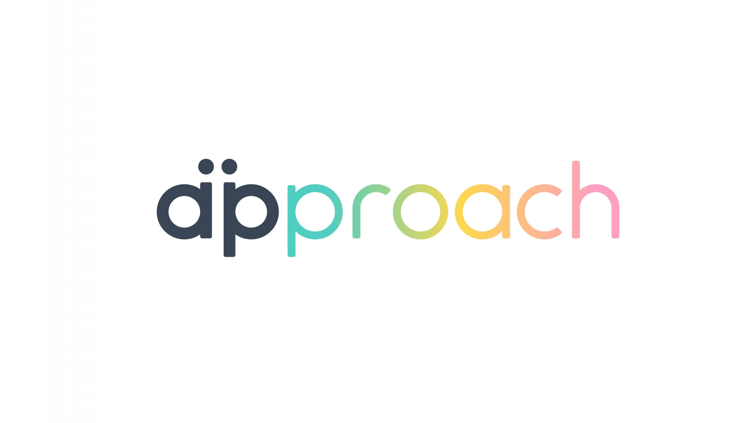
The team of entrepreneurs that leads Approach commissioned us to design the brand and product.
We're talking about a bracelet that encourages real relationships, moving away from digital apps. It's presented as an alternative to Tinder, a channel for connecting people in a more authentic way.
For the visual identity, we created a brand with a gradient of three shades, each representing a sexual orientation: homosexual, bisexual and heterosexual. This concept is also reflected in the product design.


The brand
Product design
To bring the bracelet to life, we developed the design in 3D, ensuring that every detail fit with the brand identity before moving on to the production phase. We opted for rounded shapes, thus maintaining visual coherence with the brand image and conveying a sense of proximity and softness.
In addition, the bracelet incorporates charms, small customizable elements that allow users to express their tastes and preferences. These details not only add a unique touch to each piece, but also become a subtle and elegant way to generate connections between people with shared interests.
Bbm